Whenever I put together an architecture diagram, I end up needing the same kind of visual element: a small labelled box with an icon that clearly signals what kind of service or system it represents. Keeping consistent sizing, border treatment, and colour coding across a whole diagram is tedious when you’re assembling things by hand. I built Component Creator to solve that — think of it as a button generator, but for diagram nodes.
What It Does
Select a border style, pick a font, choose an icon — and the preview updates live. That’s it. The output is a PNG you drag into Excalidraw, Figma, or wherever your diagrams live.
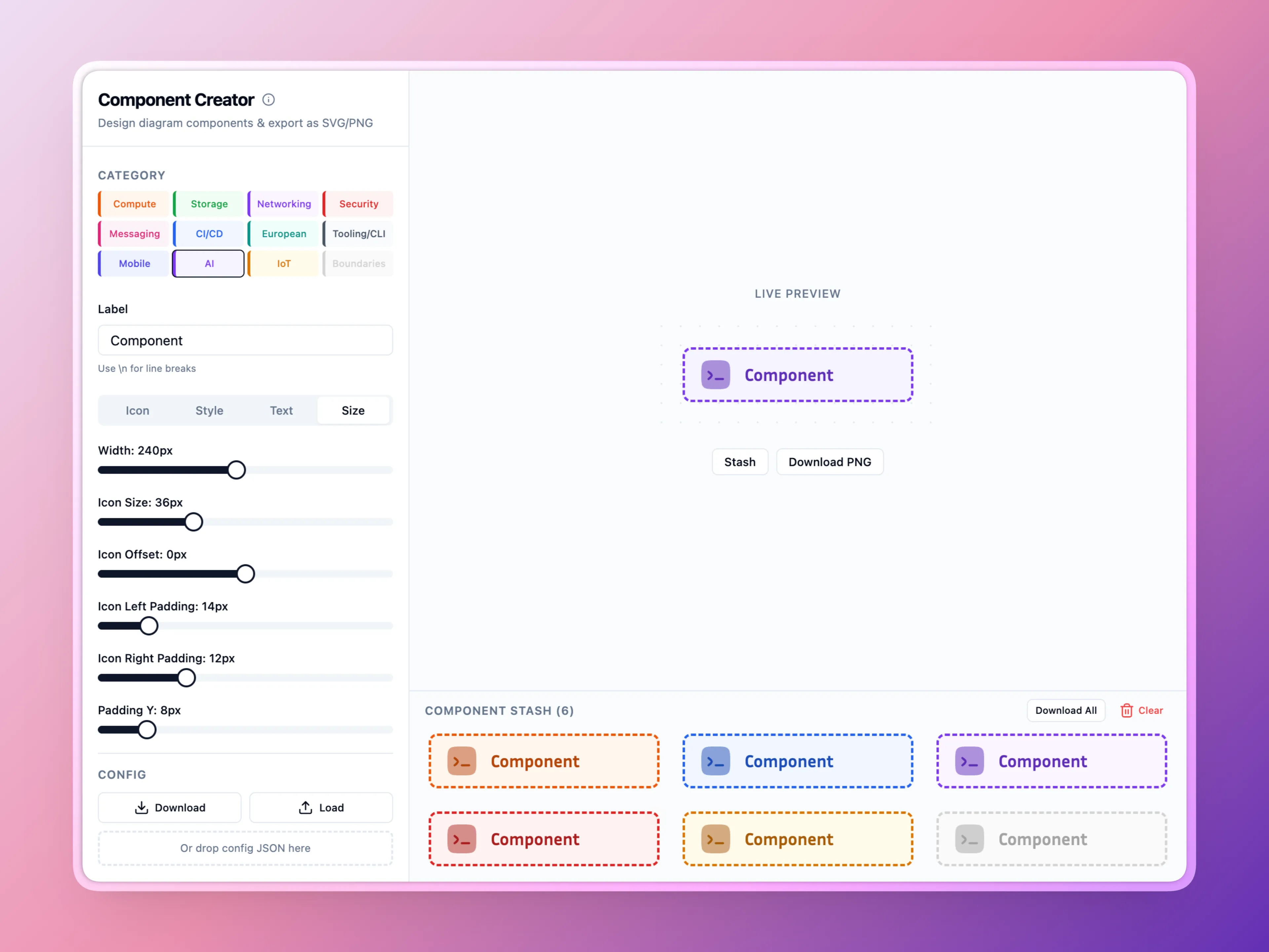
Because every node comes from the same tool with the same settings, sizing and visual weight stay consistent across the whole diagram without any manual coordination.
Icons
Component Creator pulls from several Iconify sets — Solar, Myna UI, LineIcons, Streamline Pixel, Emojione, and Emojione Mono — and accepts any raw Iconify identifier if you need something outside those. The full catalogue is at icones.js.org.
In Practice
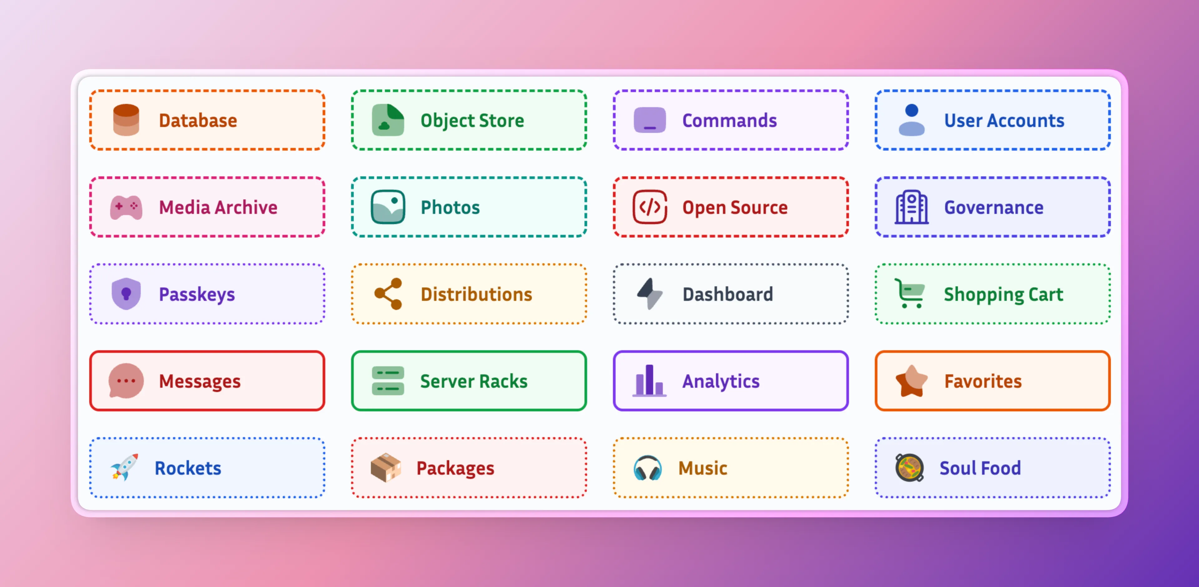
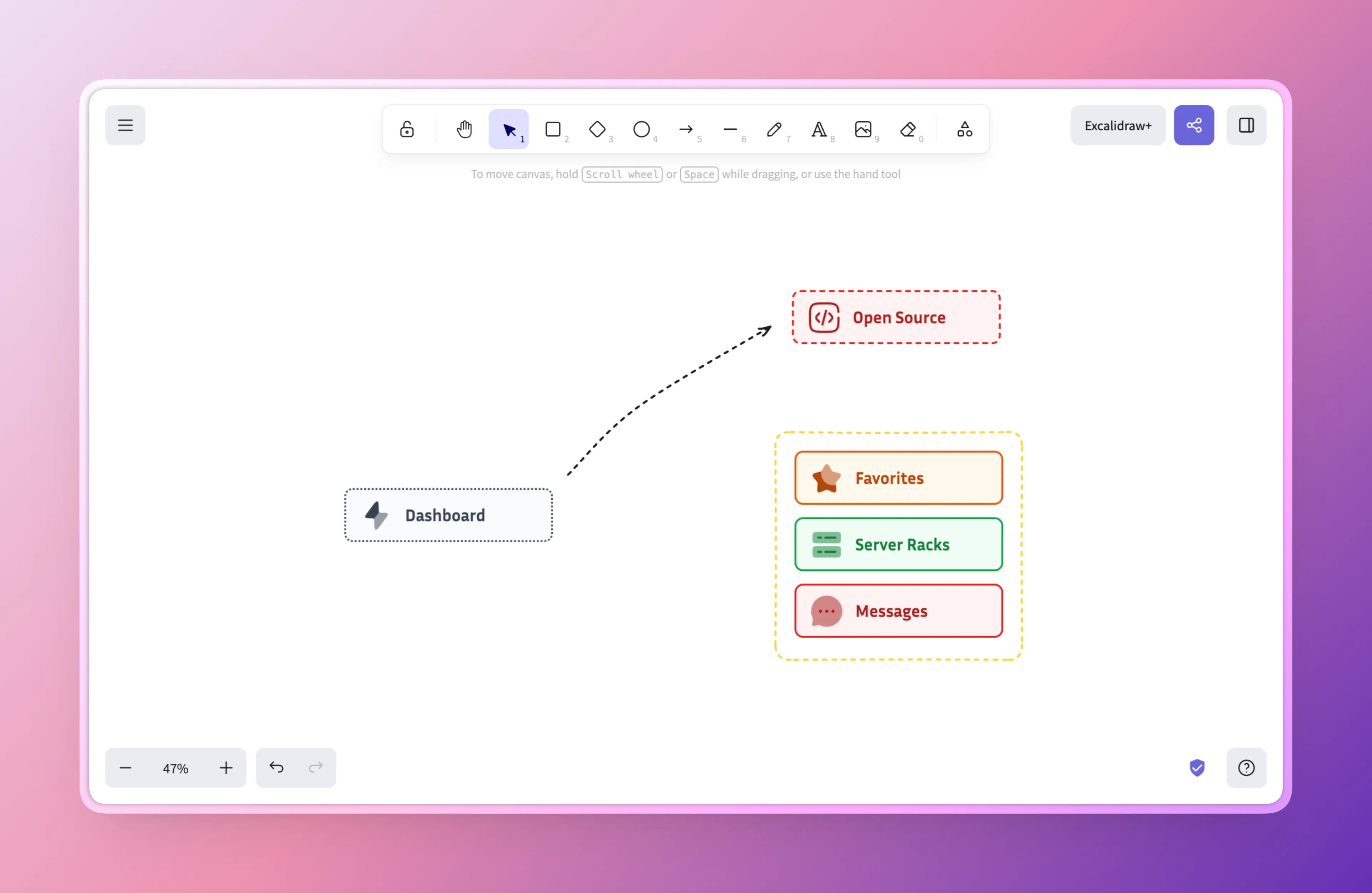
For architecture diagrams I create one component per service type, stash them all, download the ZIP, and import the batch into Excalidraw in one go. The category colour coding carries through: orange for compute, green for storage, purple for networking.
The whole thing was built with Lovable on an afternoon — it does the job quite well. The Component Creator is deployed at sbstjn-component-creator.b-cdn.net.